Assignment/ Typography/ Exploring expressive quality
有时候我的确有点迷惑不解,原本简单就是美,为何需要多此一举而让东西变得复杂又格格不入。对了,就是那种格格不入的感觉!啊!有些事唉声叹气或是怨天尤人也无济于事,就当作留给自己成名了再回忆自己曾经历过的训练吧。
~蓝天白云~
~相约黄昏~
无法冷静的白嘴鸦
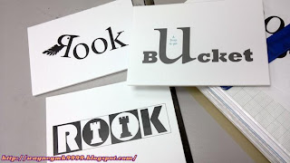
Rook is a large black European bird like a crow. I mirror the letter ‘R’ and replace the tail part of the letter with a wing shape and the spur part of the letter with a beak shape in order to make it looks like a bird. Black colour is selected as to indicate the characteristic of the crow.
~黑与白~
~红与白~
棋盘上双方对立的城堡
Rook is a piece in the shape of a tower (castle) used in the game of Chess. I replace both counters of the letters “O” with the symbol of the castle. Besides that, I did add in the black and white square box behind of each letter to make the words like standing on the chessboard.
微不足道的一水滴,怎能填满整个水桶呢?
“A drop in the bucket” is an idiom means a very small part of something big or whole. So, I magnified the letter “U” as a shape of bucket, and adjusting the “A Drop in the” like a water drop put inside the letter U to show the whole meaning of the idiom.


No comments:
Post a Comment