Typography/ Typeface Poster Design/ Final project of Typography Fundamental
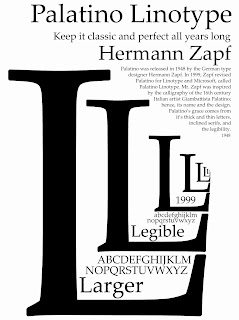
Palatino Linotype is selected for the poster design because I personally think that Palatino Linotype is one of the beautiful typefaces I have seen so far, one of the characteristic to attract attention. Palatino was released in 1948 by the German type designer Hermann Zapf. In 1999, Zapf revised Palatino for Linotype and Microsoft, called Palatino Linotype. Mr. Zapf was inspired by the calligraphy of the 16th century Italian artist Giambasttista Palatino; hence, its name and the design. Palatino's grace comes from its thick and thin letters, the inclined serifs, & its largeness and the legibility. (Information from Wikipedia)
Work in progress
At the beginning, I try to design this poster with a very specific idea in mind which involve mainly using the alphabet of ‘Q’ and ‘j’ to show the beauty of Palatino Linotype (the tail part of the typeface). But after some tests, the visual looked a bit weird, so the idea was disposed.
“This was the original concept that I created. The image here shows a rough composition of my layout.”
Later, I have sudden thought and came up with a new concept of designing this A3 poster is showing the typeface from small to big of how the typeface is still very classic and legible no matter is large or small from the past to the present. Large and legible are the main features of Palatino Linotype that I want to communicate via the poster I design. So, I created the slogan “keep it classic and perfect all years long.”
I want to create a perspective view with the alphabets forming a landscape of sorts, with focus on the large and legible characteristic of Palatino Linotype, making use of ‘L’ as the main alphabet in the design. I continued to play around with the alphabet ‘L’ in order sticks to the concept.
“These represent the development of my poster design.”
Black and white colour is selected because I want to make it contrast and easily be readable. The ‘L’ perspective view is distinct focus point in the poster and the paragraph had to be positioned at the left hand side so it was highly visible enough.
After that, I went into playing the colour to see whether create the focal point of the design and change of the position of the big title and the name of the designer.
For the alphabets of ‘L’, I wanna to go make the whole image looks more interesting. Therefore, pale orange colour is required to let the design to be noticeably different from the last. In actual printing the colour of the final outcome of pale orange colour will be looks like almost gold colour. The gold colour gives the feeling of classic and elegant. This gave me a really good excuse to go a little overboard on the final part. I think the gold colour (or pale orange colour) gives the final ‘L’ perspective view a great focal point.
By using the Photofunia.com, an online photo editing tool to see the results of how this poster will be looks like if showcased in the windows of particular shopping mall or roadside noticeboard .
So, what do you think of my design? Is it just convey the main message by the first sight? Is it gives the feeling of classic and elegant? The beauty of this design is its simplicity. I wanted to make the design simple and directly can be understand by the audience. The design should be remained as simple as possible. Memorability is key. I think this poster is describe, memorable and relevant to the meaning.
"keep it classic and perfect all years long."


No comments:
Post a Comment